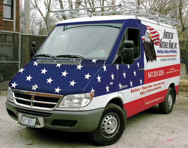
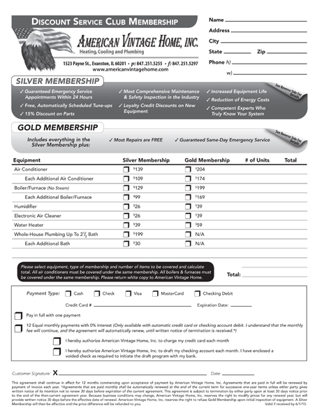
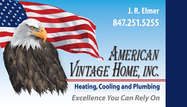
As one of the north shore's premier heating, cooling, and plumbing leaders, American Vintage Home, Inc. wanted a corporate branding makeover. Our goal was to revitalize the image of the company, not to reinvent it. For established companies, brand recognition is crucial to continued success. Our project needed to be flexible with print, web, vehicle, and signage applications so vector art was key, all within their budget.
Response:
After reviewing all existing materials, we decided to use an illustrated logo with more detail and use an American theme - bald eagle, the American flag, and a color scheme of red, white, and blue with gold accents. Initially, we focused on the Corporate ID and Direct Mail campaign. Once in place, we developed additional materials for AVH, ranging from uniform patches and promotional calendars to a new website.
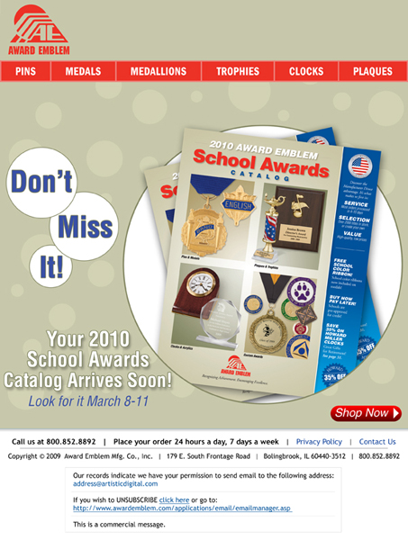
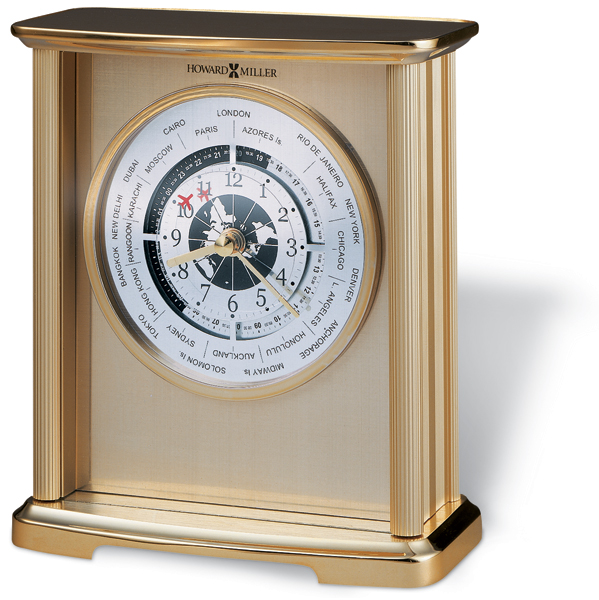
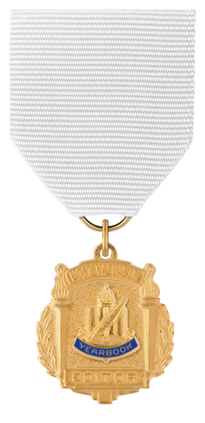
Award Emblem
Challenge:
Clip and color correct over 2,000 images to exact gold and navy blue, preparing them for catalog and online use. Most text needed be retyped for a clean look; minor imperfections in the metal made some text hard to read. We also needed to create a direct email marketing campaign.
Response:
With an AppleScript that crossed multiple applications, we batch processed images adjusting for inconsistencies in photography - the final "print" set was then again batched adjusted for the web.
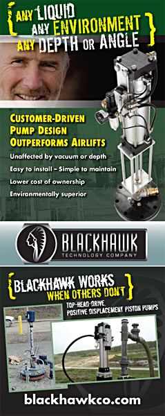
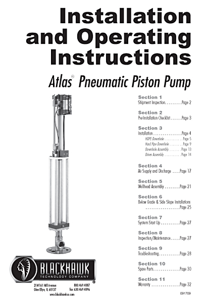
Blackhawk Technology Group
Challenge:
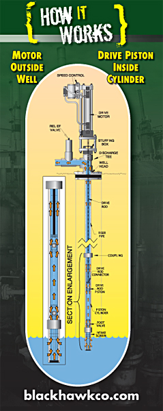
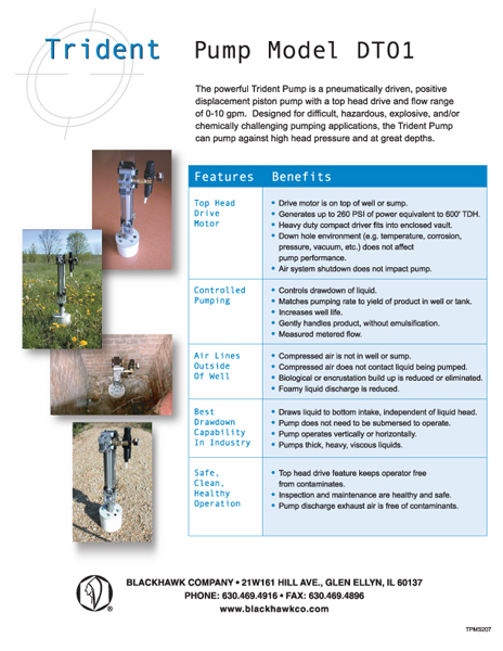
Blackhawk Technology Company provides leading-edge piston pumping solutions for a broad range of well-based applications. Blackhawk needed multiple company branding materials including customer instruction guides for their pumps. The instruction guides needed to be designed for fast “on-the-job” scanning for workers installing the pumps. Technical illustrations were inserted and some redesigning of the provided artwork was needed. Large signage, including trade show booth banners were also needed. The trade show banners needed to retain the company’s “rugged” appearance as well to easily illustrate the pump's functionality.
Response:
We designed a simple, narrow left column template for the instruction manuals. Narrow columns allow for faster scanning for the eyes. Lines of text greater than around 12 words have been shown to decrease readability. The banners were designed with a dark green and yellow color scheme with large, simple industry photography. The photos of the pumps offered a great focal point for the banners.
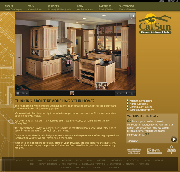
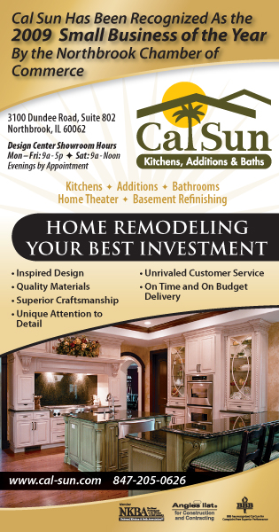
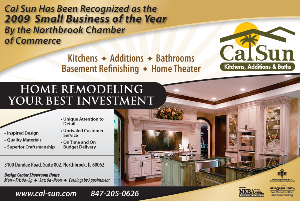
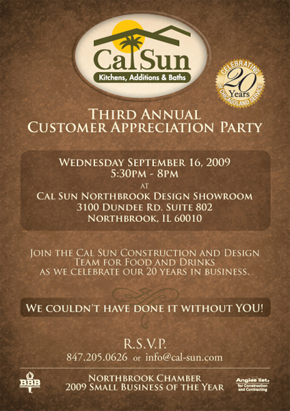
Cal Sun
Challenge:
As one of Chicago's North Shore premiere Kitchen, Addition, and Bath construction companies, Cal Sun wanted a larger and updated public appearance.
Response:
We began with the direct marketing campaign. We opted for a new grayscale with gold color scheme. The new color scheme and rounded gold gradient made for great newspaper printing and allowed the photography to take center stage. The color scheme was brought to the website along with a photo gallery allowing for full-screen views of their finest construction projects. Our web development team put a lot of focus on search engine optimization, ensuring potential customers find Cal Sun more easily.
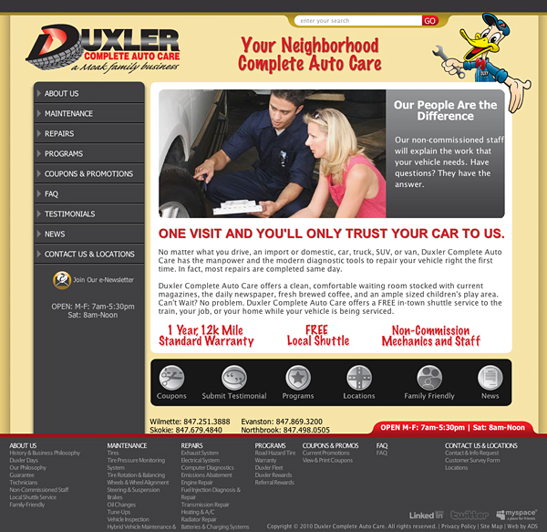
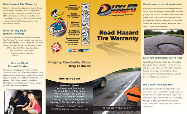
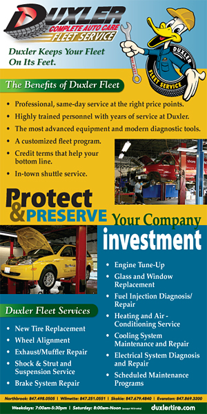
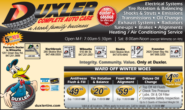
Duxler Auto Care
Challenge:
Duxler is a leader in quality auto car on the North Shore. Duxler has been a loyal ADS client since 2004; so we've updated their artwork many times through the years. Recently Duxler decided they need a new website, which would resemble the "Family Friendly" environment as well as show the technology they use. Along with the website, ADS was tasked with developing a Customer Loyalty program.
Response:
We went with a warm color scheme with lots of yellow coupled with “handwritten” text to convey a friendly feeling to potential Duxler customers. The dark gray accordion navigation allows Duxler to provide their clients with large amounts of information easily and cleanly.
We extensively researched the customer base of Duxler in preparation for our work on the Customer Loyalty Program. We examined why customers come to Duxler, and found parts of the market Duxler was not yet taking advantage of. We developed a system that will allow Duxler to thank their customers for their support.
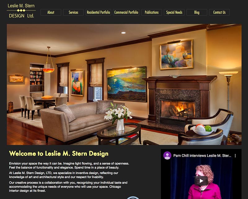
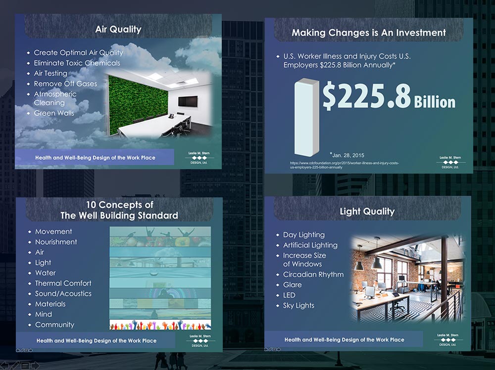
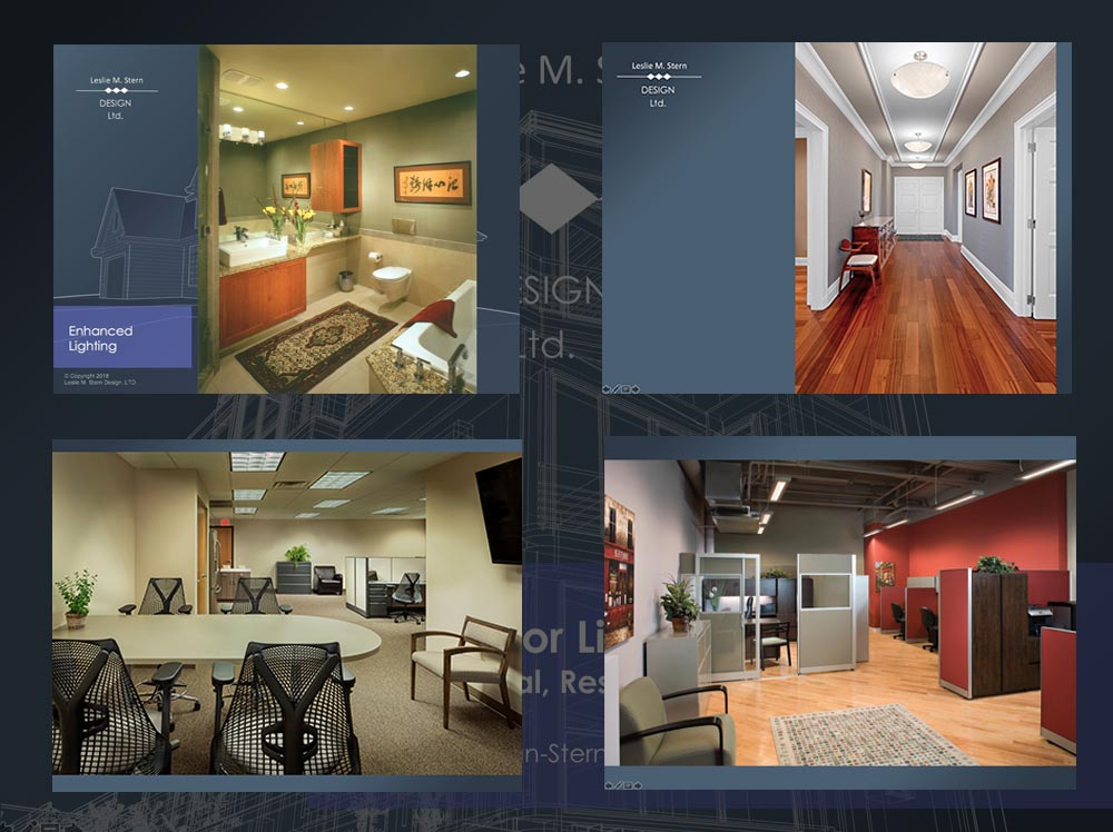
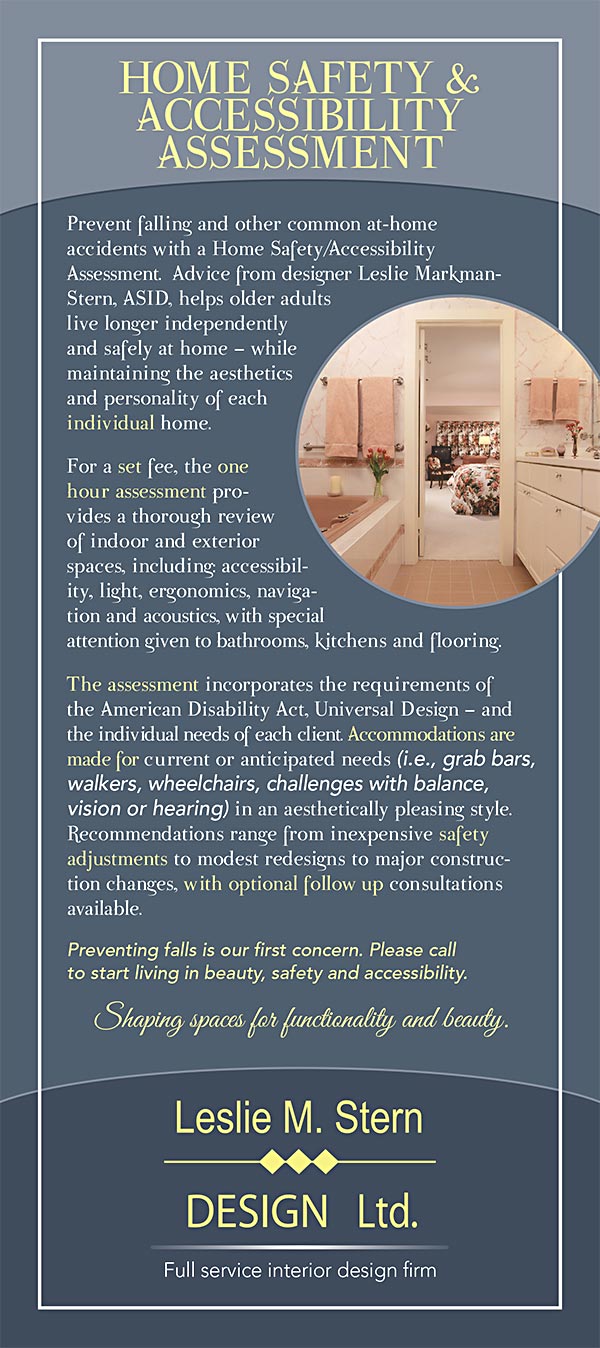
Leslie M. Stern Design
Challenge:
Leslie Stern is a phenomenal interior designer, her website and collateral was not conveying that fact. Thankfully, she had great photography in hand.
Response:
Our approach was one of "Let the designs speak for themselves" so we put together a minimalist website design to facilitate. A vertical scroll allows a visitor to get the full scope of the designs without taking up the entire top canvas so critical data is still "above the fold". She is also well published and a frequent speaker so that content is addressed and gets onto Google.
We then put together a full set of PowerPoint presentations for each of her market segments and rounded things off with a few leave-behind pieces to show off her work and expertise.
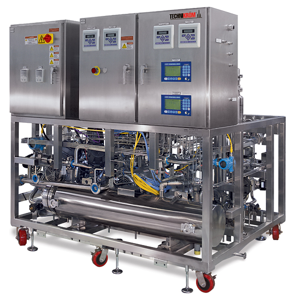
Technikrom
Challenge:
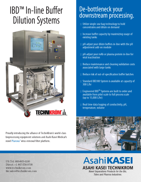
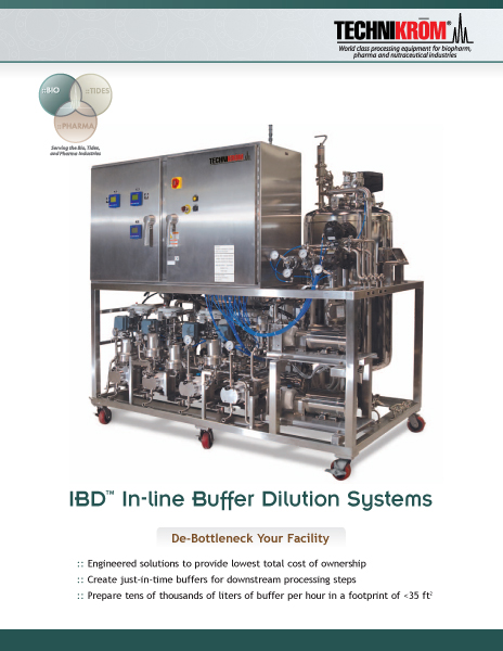
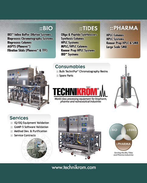
Technikrom ( Asahi-Kasei Technikom ) designs and builds equipment for the biopharmaceutical, pharmaceutical, and fine chemical industries. They requested photography and imaging services from ADS to feature their equipment in advertisements and publications.
Response:
Photographing and "clipping-out" the backgrounds of these large stainless steel machines can be tricky due to the intricate details of the tiny tubes and lines. Problems with reflections and glare are common. We devoted a lot of time to properly setting up the lighting to reduce glare and reflections. By stitching together multiple hi-res photos, we can triple or even quadruple the size of an image so it can be used for any possible application. Removing the background from the images allows the focus of the photo to be on the product, not the original setting.
Once the product photography was approved by Technikrom, we began development on a 8.5x11" brochure/booklet, illustrating the details of the product. Creating informative graphics and inserting computer screenshots allowed the buyer a quick look at the product's capabilities, ensuring the sale.
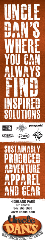
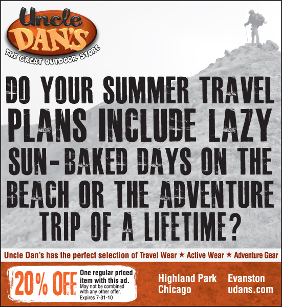
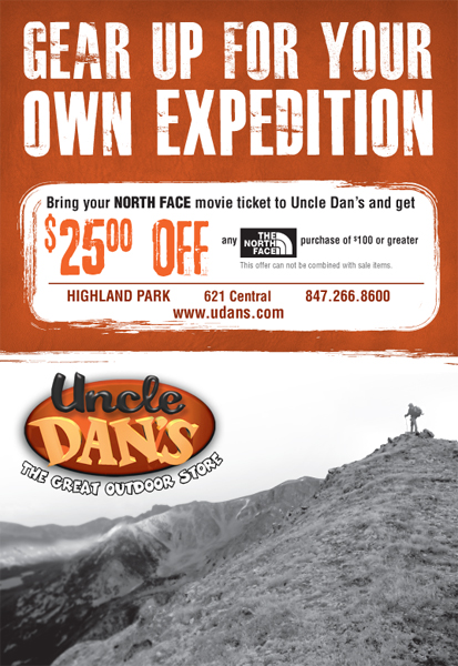
Uncle Dan's
Challenge:
Uncle Dan's is a supplier of outdoor apparel selling products ranging from clothing to hiking gear. Uncle Dan's has a long-standing relationship with ADS. They recently requested we work on re-branding their image to promote a more “outdoor and adventure” look.
Response:
Reviewing the existing Direct Marketing and in-store pieces, ADS reduced the amount of colors being used and began branding the Uncle Dan's orange paired with a black and white photo background. Simplifying the color scheme allowed for the headline to stand out. We enhanced the look by using an oversized weathered font. The weathered look is also reflected in the coupons and borders to give the advertisements a less corporate feel.
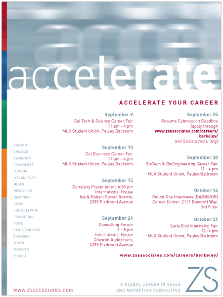
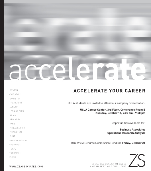
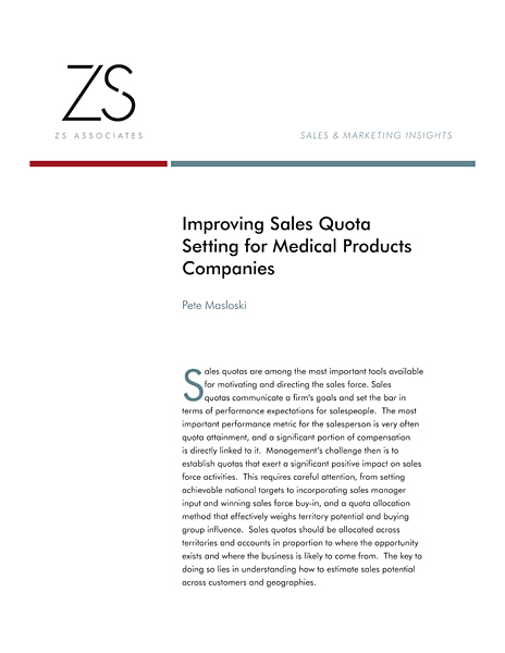
ZS Associates
Challenge:
ZS Associates is a world-wide leader in sales and marketing consulting, capability building, and outsourcing. With very tight deadlines for every project, ADS developed a series of white-papers (a report or guide) and recruitment ads for colleges around the world. Adhering to the strict company regulations regarding design was not always an easy task.
Response:
Templates previously designed by ZS Associates didn't always accommodate the amount of graphics and information needed in the White-papers. We have a great deal of experience working within corporate regulations, so we were able to adhere to the guidelines while reformatting the graphics to fit properly as requested.
Recruitment ads come in to the agency fast and furious during the college semesters promoting ZS Associates seminars, job openings, etc, each with a shorter deadline than the last. We turned all projects around with no problem at all.